may improvement po ba?
+11
marcelinoiii
scorpion21
Dabuy02
ortzak
arkiedmund
jarul
brodger
zdesign
deosrock
Canadium
jheteg
15 posters
:: 3d Gallery :: Exteriors
Page 1 of 2
Page 1 of 2 • 1, 2 
 may improvement po ba?
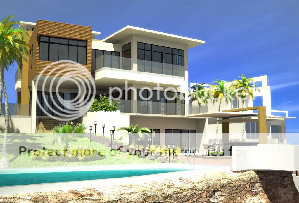
share kolang po previous renders ko. located po sa punta fuego batangas. 3storey residence with roofdeck. cad-maxvray-ps
eto po yung harapan ng house.

cliff napo after ng swimming pool, then dagat na. katabi po ng knox house if familiar po kayo sa house. likod po ito ng bahay.

eto naman po yung unang render ko before. sa kaka cgp at 3dp medyo nag improve naman po siguro. agree po ba kayo mga masters? paki cc nalang po. thanks

eto po yung harapan ng house.

cliff napo after ng swimming pool, then dagat na. katabi po ng knox house if familiar po kayo sa house. likod po ito ng bahay.

eto naman po yung unang render ko before. sa kaka cgp at 3dp medyo nag improve naman po siguro. agree po ba kayo mga masters? paki cc nalang po. thanks

 Re: may improvement po ba?
Very nice renders Sir! The lighting is really great. Looking at that old render you mentioned, the difference is very huge cabalen!
 Re: may improvement po ba?
okey naman sya a,1st and 2nd okey sa kin. wala na lang sana tao para focus sa model design mo.imho lang.
 Re: may improvement po ba?
Great improvement SIr!...siguro we need railings sa front steps for safety..a simple design will do, just match the color with the window frame or darker.(imho lang po)
Agree with sir zdesign.
Sir..saan po ba parking area?

Agree with sir zdesign.
Sir..saan po ba parking area?


Last edited by samokmisay on Sat May 15, 2010 11:52 pm; edited 1 time in total (Reason for editing : smiley did not show)

brodger- CGP Guru

- Number of posts : 1747
Age : 46
Location : ligid ha Daguitan X Burawon
Registration date : 14/05/2010
 Re: may improvement po ba?
salamat po sir.Canadium wrote:Very nice renders Sir! The lighting is really great. Looking at that old render you mentioned, the difference is very huge cabalen!
Last edited by jheteg on Sun May 16, 2010 12:04 am; edited 1 time in total
 Re: may improvement po ba?
thank you po sir. magaling din po kayo.deosrock wrote:-anlaki ng improvement sir! ang galing nyo!

 Re: may improvement po ba?
napagkatuwaan lang po yung mga taong naka bikini.zdesign wrote:okey naman sya a,1st and 2nd okey sa kin. wala na lang sana tao para focus sa model design mo.imho lang.
 Re: may improvement po ba?
samokmisay wrote:Great improvement SIr!...siguro we need railings sa front steps for safety..a simple design will do, just match the color with the window frame or darker.(imho lang po)
Agree with sir zdesign.
Sir..saan po ba parking area?
noted po sir. salamat sa opinyon.
about po sa parking area. check nalang po itong isa pang view (old rendering lang po)

 Re: may improvement po ba?
Huge improvement indeed.
I'd loose the human entourage, if i were you. They look like zombies and are a bit stiff. Maybe, setting their receive g.i. properties to .5 will do the trick, i haven't really tried using those 3d peeps on my scenes just yet.
Add a bit of contrast too.
I like the 1st image the most. keep posting.
I'd loose the human entourage, if i were you. They look like zombies and are a bit stiff. Maybe, setting their receive g.i. properties to .5 will do the trick, i haven't really tried using those 3d peeps on my scenes just yet.
Add a bit of contrast too.
I like the 1st image the most. keep posting.

arkiedmund- Manager

- Number of posts : 3956
Age : 51
Location : Cavite
Registration date : 19/09/2008
 Re: may improvement po ba?
Laki ng improvement cabalen..nasabi na nila...
-kaunting contrast lang
-tao a bit dull..
add railings sa cliff..a glass might do the trick mahal pero the view is priceless

-kaunting contrast lang
-tao a bit dull..
add railings sa cliff..a glass might do the trick mahal pero the view is priceless

 Re: may improvement po ba?
jarul wrote:galing nga.
sa 1st & 2nd image...konting konting contrast lang...
maraming salamat po master jarul. contrast indeed.

 Re: may improvement po ba?
arkiedmund wrote:Huge improvement indeed.
I'd loose the human entourage, if i were you. They look like zombies and are a bit stiff. Maybe, setting their receive g.i. properties to .5 will do the trick, i haven't really tried using those 3d peeps on my scenes just yet.
Add a bit of contrast too.
I like the 1st image the most. keep posting.
thanks for dropping by and for the tips.
 Re: may improvement po ba?
ortzak wrote:Laki ng improvement cabalen..nasabi na nila...
-kaunting contrast lang
-tao a bit dull..
add railings sa cliff..a glass might do the trick mahal pero the view is priceless
noted sir. salamat po
 Re: may improvement po ba?
aus to cabalen.. laki ng improvemnt..  buhay na buhay.... gaya nga ng sabi ni master jarul,, konting contrast nlang..
  nice work post more sir
 nice work post more sir
Dabuy02- CGP Apprentice

- Number of posts : 394
Age : 69
Location : angeles city, Pampanga
Registration date : 28/04/2009
 Re: may improvement po ba?
thank you cabalen sa pagbisita.Dabuy02 wrote:aus to cabalen.. laki ng improvemnt..buhay na buhay.... gaya nga ng sabi ni master jarul,, konting contrast nlang..
nice work post more sir
 Re: may improvement po ba?
meron bro...malaki... 


scorpion21- CGP Apprentice

- Number of posts : 769
Age : 78
Location : PI
Registration date : 28/06/2009
 Re: may improvement po ba?
great design sir!!! and the render is way better than the previous one. Big improvement sir! master level na nga e. 


marcelinoiii- CGP Guru

- Number of posts : 1125
Age : 42
Location : Singapore
Registration date : 29/07/2009
 Re: may improvement po ba?
huge improvement .... keep it up 


bartsimpson- CGP Apprentice

- Number of posts : 834
Age : 48
Location : Riyadh KSA / bicol legazpi
Registration date : 31/03/2009
 Re: may improvement po ba?
render lang po ako sir. salamat po sa papurimarcelinoiii wrote:great design sir!!! and the render is way better than the previous one. Big improvement sir! master level na nga e.
 Re: may improvement po ba?
thank you po sir ng maramibartsimpson wrote:huge improvement .... keep it up
 Re: may improvement po ba?
[quote="jheteg"]
noted po sir. salamat sa opinyon.
about po sa parking area. check nalang po itong isa pang view (old rendering lang po)
Thank's po Sir Jheteg for providing this view..hope to see more views using your new settings. galing po!
samokmisay wrote:Great improvement SIr!...siguro we need railings sa front steps for safety..a simple design will do, just match the color with the window frame or darker.(imho lang po)
Agree with sir zdesign.
Sir..saan po ba parking area?
noted po sir. salamat sa opinyon.
about po sa parking area. check nalang po itong isa pang view (old rendering lang po)
Thank's po Sir Jheteg for providing this view..hope to see more views using your new settings. galing po!

brodger- CGP Guru

- Number of posts : 1747
Age : 46
Location : ligid ha Daguitan X Burawon
Registration date : 14/05/2010
 Re: may improvement po ba?
[quote="samokmisay"]
sige po sir, pag di na masyadong loaded sa work try po natin makapag render ng ibang view. salamat po sa pagpasyal.
jheteg wrote:samokmisay wrote:Great improvement SIr!...siguro we need railings sa front steps for safety..a simple design will do, just match the color with the window frame or darker.(imho lang po)
Agree with sir zdesign.
Sir..saan po ba parking area?
noted po sir. salamat sa opinyon.
about po sa parking area. check nalang po itong isa pang view (old rendering lang po)
Thank's po Sir Jheteg for providing this view..hope to see more views using your new settings. galing po!
sige po sir, pag di na masyadong loaded sa work try po natin makapag render ng ibang view. salamat po sa pagpasyal.
Page 1 of 2 • 1, 2 
 Similar topics
» Comments for Improvement
» pashare po mga sir... su+vraymax+PScs3.. cnc's are most welcome for improvement TIA
» room for improvement!
» Forum Improvement
» 2-storey renovation/improvement
» pashare po mga sir... su+vraymax+PScs3.. cnc's are most welcome for improvement TIA
» room for improvement!
» Forum Improvement
» 2-storey renovation/improvement
:: 3d Gallery :: Exteriors
Page 1 of 2
Permissions in this forum:
You cannot reply to topics in this forum


