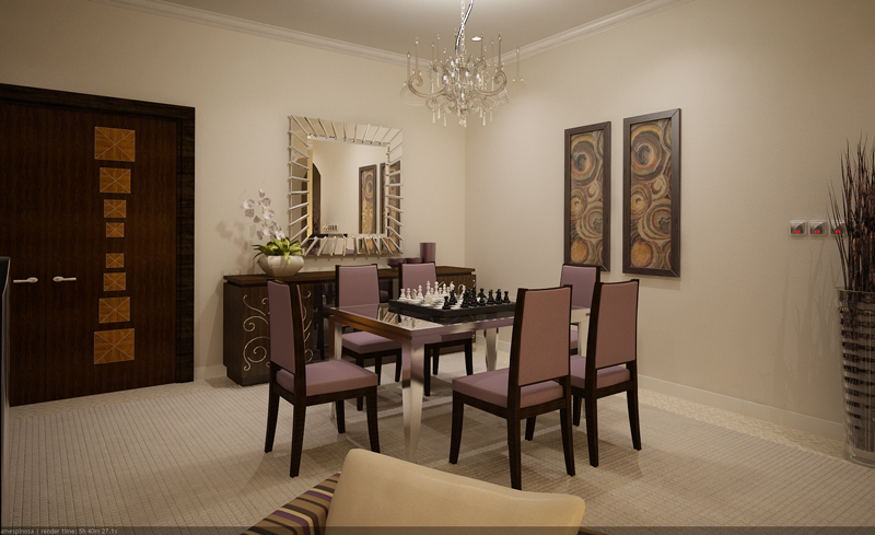
Sarah Salon Area - options
+25
Stryker
Butz_Arki
Ar_Can_EVSU
Yhna
pakunat
alwin
ytsejeffx
rojs_211
aldrinv2
allnem
dreffyves3d
ramzARKI
rangalua
icefrik19
bongskeigle
ortzak
balongeisler
yaug_03
nicotinefreeman
archbmc77
revtrax
Tracer
3DZONE
jenaro
a.espinosa
29 posters
:: 3d Gallery :: Exteriors
Page 2 of 2
Page 2 of 2 •  1, 2
1, 2
 Sarah Salon Area - options
First topic message reminder :
another set for comment mga masters


other option


thanks again master
another set for comment mga masters


other option


thanks again master

Last edited by a.espinosa on Sat Nov 07, 2009 6:39 am; edited 3 times in total (Reason for editing : additional shots)
 Re: Sarah Salon Area - options
hirap mag-detail pero worthwhile naman pag natapos na...thanks again icefrik19
icefrik19 wrote:love da details galing
 Re: Sarah Salon Area - options
Galing ng 5th image Sir....mahusay..  like it-roger
 like it-roger
rojs_211- CGP Apprentice

- Number of posts : 664
Age : 38
Location : La Union
Registration date : 11/09/2009
 Re: Sarah Salon Area - options
nice images lahat! wala akong comments!

alwin- CGP Expert

- Number of posts : 2176
Age : 51
Location : basurero sa cebu
Registration date : 22/01/2009
 Re: Sarah Salon Area - options
musta boss.
here are my comments:
2nd image:
1. something missing sa wall. maybe some beadings. maybe.
2. i cant determine the theme of the interior sir. sorry
3. maybe sir a darker floor will put contrast bet. wall and flr.
4. you can take the pattern that you've used in the wall to make an elegant looking screen/partition bet. living and dining.
5. to much sofa going on sir. maybe put a lounger instead of the 2 armchair where they can rest there back and simple relax.
im not also sure sa mga decoration sir it made the whole seen cluttered.
3rd image:
1. i would love to see the other side of the wal in diff. tonality to make the sceen more interesting.
2.take away chessboard way too huge.
3. that plant is everywhere. and i think its not suppose to be there. honestly.
5th image
1. those vases are to huge. same coment on the deco. sir
2. the sidetable bet. the 2 archairs is too high. 500-600 cguro ok na.
3. same comment on the floor,wall and the 2 armchairs.
4. the lampshade in the corner looks like it is there for no purpose. y? blame it to the sidetable. what you can do sir is you can swap the position of the tall lampshade and the table with the lampshade. im sure it will look better.
thats all sir. i know you will hate me after this. my comments are in my honest opinion sir. Merry Christmas
 Re: Sarah Salon Area - options
galing naman po.... ganda sir 


Yhna- Princess Gaara

- Number of posts : 1886
Age : 39
Location : Qatar ...
Registration date : 27/11/2008
 Re: Sarah Salon Area - options
ayuuuussss....that's what i call a productive comment...thank you so much master pakunat...ibang level na ang pag-comment sir ha....hehehehe....i appreciate it
thanks
alex
thanks
alex
pakunat wrote:musta boss.
here are my comments:
2nd image:
1. something missing sa wall. maybe some beadings. maybe.
2. i cant determine the theme of the interior sir. sorry
3. maybe sir a darker floor will put contrast bet. wall and flr.
4. you can take the pattern that you've used in the wall to make an elegant looking screen/partition bet. living and dining.
5. to much sofa going on sir. maybe put a lounger instead of the 2 armchair where they can rest there back and simple relax.
im not also sure sa mga decoration sir it made the whole seen cluttered.
3rd image:
1. i would love to see the other side of the wal in diff. tonality to make the sceen more interesting.
2.take away chessboard way too huge.
3. that plant is everywhere. and i think its not suppose to be there. honestly.
5th image
1. those vases are to huge. same coment on the deco. sir
2. the sidetable bet. the 2 archairs is too high. 500-600 cguro ok na.
3. same comment on the floor,wall and the 2 armchairs.
4. the lampshade in the corner looks like it is there for no purpose. y? blame it to the sidetable. what you can do sir is you can swap the position of the tall lampshade and the table with the lampshade. im sure it will look better.
thats all sir. i know you will hate me after this. my comments are in my honest opinion sir. Merry Christmas
 Re: Sarah Salon Area - options
thanks sa pagdaan master mam yhna...
impress din po ako sa mga works nyo
impress din po ako sa mga works nyo
Yhna wrote:galing naman po.... ganda sir
 Re: Sarah Salon Area - options
superb output!!!

Ar_Can_EVSU- CGP Guru

- Number of posts : 1291
Age : 93
Location : An-Hawaii_Palo_Tacloban/Leyte
Registration date : 17/02/2009
 Re: Sarah Salon Area - options
suki thanks sa pagdaan ulit...heheeheh

Ar_Can_EVSU wrote:superb output!!!

 Re: Sarah Salon Area - options
perfect again... 


dreffyves3d- CGP Apprentice

- Number of posts : 344
Age : 41
Location : dubai/cebu
Registration date : 08/09/2009
 Re: Sarah Salon Area - options
nice galeng sir... sir question ano ung flooring mo sa first two image? carpet? hindi ba mejo malaki ung tiling nia???! 
Ganda ng mga models mo sir... linis din ng render...!

Ganda ng mga models mo sir... linis din ng render...!


Stryker- The Architect

- Number of posts : 1875
Age : 46
Location : Tagaytay City
Registration date : 12/12/2008
 Re: Sarah Salon Area - options
nice set of renders...linis sir..at di masakit sa mata...

knives seiji kun- CGP Apprentice

- Number of posts : 458
Age : 41
Location : Davao,Bahrain
Registration date : 18/02/2009
 Re: Sarah Salon Area - options
walang akong masabi master ace ....hehehe ...kep it up brod ... o.t kelan eb natin??? hehehe makapag amazing naman... 


bartsimpson- CGP Apprentice

- Number of posts : 834
Age : 48
Location : Riyadh KSA / bicol legazpi
Registration date : 31/03/2009
 Re: Sarah Salon Area - options
Comment din ako heheheh.. ganda sir ng pagka-render.
- assume the height of the sofa armrest para sa height ng side table
- strong color for the wall paintings will give interest to that wall
- haspi ng wooden door jamb -see this http://www.cgpinoy.org/3d-studio-max-tutorials-f46/3d-max-material-composition-tips-t3872-30.htm#198301
- assume the height of the sofa armrest para sa height ng side table
- strong color for the wall paintings will give interest to that wall
- haspi ng wooden door jamb -see this http://www.cgpinoy.org/3d-studio-max-tutorials-f46/3d-max-material-composition-tips-t3872-30.htm#198301
Last edited by render master on Tue Mar 09, 2010 4:46 am; edited 1 time in total

render master- Game Master

- Number of posts : 3274
Age : 104
Location : riyadh, saudi arabia
Registration date : 27/09/2008
 Re: Sarah Salon Area - options
thanks sa like mga bossing...comments are very much appreciated para kauunlad ..hehehe.. 

Page 2 of 2 •  1, 2
1, 2
 Similar topics
» sarah and friends
» Some TV STUDIO options
» SU+Vray : Master's Bedroom + Living Area + Dining Area (Update + Settings)
» silid-tulogan ni sarah
» Design Options...
» Some TV STUDIO options
» SU+Vray : Master's Bedroom + Living Area + Dining Area (Update + Settings)
» silid-tulogan ni sarah
» Design Options...
:: 3d Gallery :: Exteriors
Page 2 of 2
Permissions in this forum:
You cannot reply to topics in this forum


