Commercial and Residential
+2
Zyl
Agda
6 posters
:: 3d Gallery :: Exteriors
Page 1 of 1
 Commercial and Residential
Hi CGP..... Matagal na rin hinde naka pagpost dito..... Pa CC na lang mga masters and members..... WF 3dsmax,vray,PS...

4 Storey commercial building

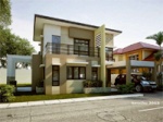
2 Storey residential building

4 Storey commercial building

2 Storey residential building

Agda- CGP Guru

- Number of posts : 1446
Age : 45
Location : Asiaslatincity
Registration date : 16/09/2010
 Re: Commercial and Residential
"ESTE MI IDOL"
Love to see your work Master Agda!
Ok ya ba el Zamboanga now?
Love to see your work Master Agda!

Ok ya ba el Zamboanga now?

Zyl- CGP Apprentice

- Number of posts : 435
Age : 34
Location : Latin City - Orchid City - Cebu
Registration date : 30/04/2013
 Re: Commercial and Residential
Grascias sir Zyl. Ok naman dito sa zc sir. Nasanay na...Zyl wrote:"ESTE MI IDOL"
Love to see your work Master Agda!
Ok ya ba el Zamboanga now?

Agda- CGP Guru

- Number of posts : 1446
Age : 45
Location : Asiaslatincity
Registration date : 16/09/2010
 Re: Commercial and Residential
nice work sir..
mito1019- CGP Newbie

- Number of posts : 83
Age : 41
Location : makati
Registration date : 19/11/2012
 Re: Commercial and Residential
wow nice set of renders master 


kenchu- CGP Newbie

- Number of posts : 84
Age : 32
Location : somewhere over the rainbow
Registration date : 30/07/2011
 Re: Commercial and Residential
The materials on the commercial building (specially the red surfaces) looks like plastic or brushed off metal surface to me. If the intention was such then its fine but considering the usual construction process in the philippines, I assume it was painted concrete. If the target was the latter then the glossy reflection is quite off.
Rendering wise (residential), there is no visible depth/distance that would distinguish the foreground and the background.
A bit of DOF or fog or saturation of colors to highlight the main subject would help. The very common dried leaves on the ground did not help either because of the placement. That part was too conspicous like it was intentionally put there rather than nature ramdomly making those leaves settle.
Remember that the audience already knows this image is CG or make believe - to make CG effective it has to confuse the audience on believing and later accepting it was real.
 Re: Commercial and Residential
Thanks sir Mito...mito1019 wrote:nice work sir..

Agda- CGP Guru

- Number of posts : 1446
Age : 45
Location : Asiaslatincity
Registration date : 16/09/2010
 Re: Commercial and Residential
Thanks sir Kenchu....kenchu wrote:wow nice set of renders master

Agda- CGP Guru

- Number of posts : 1446
Age : 45
Location : Asiaslatincity
Registration date : 16/09/2010
 Re: Commercial and Residential
Thanks sir juv 21...juv21 wrote:as usual sir,,, very nice design & rendering..

Agda- CGP Guru

- Number of posts : 1446
Age : 45
Location : Asiaslatincity
Registration date : 16/09/2010
 Re: Commercial and Residential
Thanks for taking time in dissecting my work(s) sir. I will take note of all this.... I really appreciate it sir.....v_wrangler wrote:The materials on the commercial building (specially the red surfaces) looks like plastic or brushed off metal surface to me. If the intention was such then its fine but considering the usual construction process in the philippines, I assume it was painted concrete. If the target was the latter then the glossy reflection is quite off.
Rendering wise (residential), there is no visible depth/distance that would distinguish the foreground and the background.
A bit of DOF or fog or saturation of colors to highlight the main subject would help. The very common dried leaves on the ground did not help either because of the placement. That part was too conspicous like it was intentionally put there rather than nature ramdomly making those leaves settle.
Remember that the audience already knows this image is CG or make believe - to make CG effective it has to confuse the audience on believing and later accepting it was real.

Agda- CGP Guru

- Number of posts : 1446
Age : 45
Location : Asiaslatincity
Registration date : 16/09/2010
 Similar topics
» >>>>Commercial/REsidential po.....
» Commercial Residential
» g+2 residential/commercial
» residential/commercial
» residential and commercial
» Commercial Residential
» g+2 residential/commercial
» residential/commercial
» residential and commercial
:: 3d Gallery :: Exteriors
Page 1 of 1
Permissions in this forum:
You cannot reply to topics in this forum


