HOTEL
+13
pakunat
demonpepper
Stryker
dhandora
denz_arki2008
cubi_o:
darwinzzkie
silvercrown
uwak
vamp_lestat
alwin
arkiedmund
3dpjumong2007
17 posters
:: 3d Gallery :: Exteriors
Page 1 of 2
Page 1 of 2 • 1, 2 
 HOTEL
HOTEL
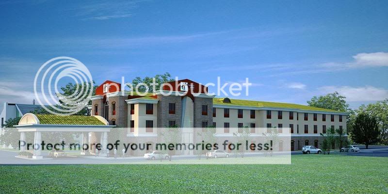
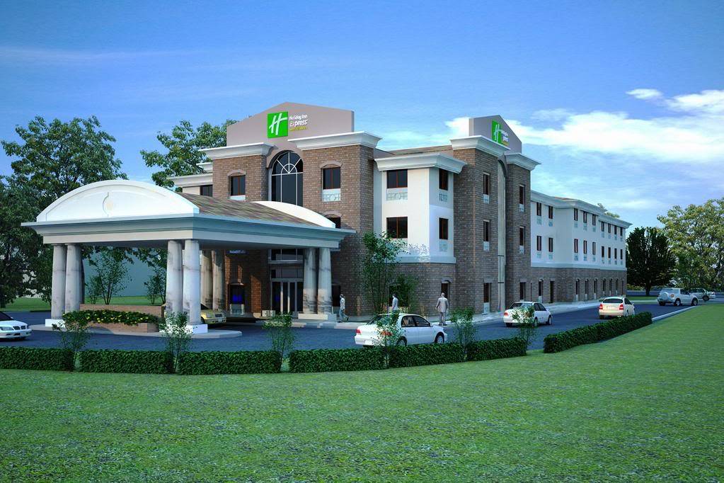
good day mga cgpeps !ito na naman ako may raket na naman sa gilid , its a HOTEL in US , modelling in a day rendering sa gabi again done in cad rendering in max 9 w/ vray plus PI..
VIEW 1

VIEW2

VIEW 1

VIEW2

 Re: HOTEL
Aba bago to, international na...
Here are the points to work on:
1. Mapping issues on your round columns, and it seems to be segmented.
2. One of the cornice molding on 2nd image seems to be short, better extend it to the wall.
3. Lighting can be tweaked some more, to add more punch to your scene. If this was done using vray sun and vray camera, then this still has a lot of room for improvement. Those tools are cool, but are a bit steep on the learning curve. I would suggest sticking to standard lighting and camera systems, until you get a handle on the overall feel of your image before moving on to those tools.
4. Kerb or sidewalk across your building is missing.
5. Work on you r entourage (trees, people, cars). I guess there should be ample vegetation on this one, and populate it with people, you can do that on your image editing software, instead of rendering in together with your scene.
Malayo na ang narating mo general jumong, konting hagod pa, I am sure, mas mag-i-improve ka pa.

arkiedmund- Manager

- Number of posts : 3956
Age : 51
Location : Cavite
Registration date : 19/09/2008
 Re: HOTEL
master jumong kumana kana naman! nice sir! minor comments lang sir is to add more abubots to look more drama in your scene maganda siguro sir yung sa EArchEx na mga grass i save as mat lib mo then i apply mo dyan cgurado ganda lalo yan!
Last edited by alwin on Sat Mar 07, 2009 9:17 pm; edited 1 time in total (Reason for editing : wrong spelling)

alwin- CGP Expert

- Number of posts : 2176
Age : 51
Location : basurero sa cebu
Registration date : 22/01/2009
 Re: HOTEL
sir... i guess.. sir arkiedmund have a very good cnc's on you...as for me just to add on it.. just try to add displacement on the grass that are near to your camera.. u will really see the difference and appreciate it... keep em postin...

vamp_lestat- CGP Guru

- Number of posts : 1930
Age : 41
Location : Davao City, Philippines
Registration date : 27/11/2008
 Re: HOTEL
comments have been said, additional lang po....put a sidewalk as termination between the road and the grass...yun lamang po.
nice lighting.
keep it up!
nice lighting.

keep it up!

 Re: HOTEL
Master jumong! ayaw paawat ah? international na eto ah? medyo matrabaho pag ganito kalawak ang foreground ,kaya dagdag elements lang cguro... talagang US na to bro ah? slump ngayon sa US pero talagang nakakakuha ka pa dun ha? lakas ng powers mo talaga bro! hehehehe.... Keep it up! 


silvercrown- CGP Apprentice

- Number of posts : 981
Age : 49
Location : Toronto, Mandaue, Polomolok
Registration date : 05/11/2008
 Re: HOTEL
arkiedmund wrote:Aba bago to, international na...
Here are the points to work on:
1. Mapping issues on your round columns, and it seems to be segmented.
2. One of the cornice molding on 2nd image seems to be short, better extend it to the wall.
3. Lighting can be tweaked some more, to add more punch to your scene. If this was done using vray sun and vray camera, then this still has a lot of room for improvement. Those tools are cool, but are a bit steep on the learning curve. I would suggest sticking to standard lighting and camera systems, until you get a handle on the overall feel of your image before moving on to those tools.
4. Kerb or sidewalk across your building is missing.
5. Work on you r entourage (trees, people, cars). I guess there should be ample vegetation on this one, and populate it with people, you can do that on your image editing software, instead of rendering in together with your scene.
Malayo na ang narating mo general jumong, konting hagod pa, I am sure, mas mag-i-improve ka pa.
 Re: HOTEL
ha ha ha !yap bout those columns di ata naka high ang mga default ko sa arc and circle ko kaya di ko napansin and tama ka doon sa cornice he he he di ata na move ng modeller ko di ko na nabalikan ,sa lighting 1 lng GI subdivs ko malaki lng image , i never tried pa kasi i full ang setting baka kasi tatagal masyado ang yun curb meron yan natakpan lng sa default ng displacement yap bout sa trees cguro yan dapat dagdagan ...
tnks ed di magtatagal mamaster ko na to kunting kunti na lang salamat sa comments this really works for me bro! post ko pa ang isa hotel din maya maya
tnks ed di magtatagal mamaster ko na to kunting kunti na lang salamat sa comments this really works for me bro! post ko pa ang isa hotel din maya maya
 Re: HOTEL
pwede!  nasabi na po nla lahat.
masasabi ko lang hindi ka lang pampamilya pang international pa.
 nasabi na po nla lahat.
masasabi ko lang hindi ka lang pampamilya pang international pa.


darwinzzkie- Guwapingz

- Number of posts : 649
Age : 38
Location : Manila, Aguilar Pangasinan
Registration date : 18/02/2009
 Re: HOTEL
sir jums... comments been said sir..
talagang iba na ang kalidad nyo sir...
i like ur presentation and render sir.
kip em coming!

talagang iba na ang kalidad nyo sir...
i like ur presentation and render sir.
kip em coming!


cubi_o:- The Hobbyist

- Number of posts : 1210
Registration date : 21/09/2008
 Re: HOTEL
ok to sir jumong........
ok na ung contrast ng gawa nyo........
more power.....
ok na ung contrast ng gawa nyo........
more power.....

denz_arki2008- Punk Zappa

- Number of posts : 1346
Registration date : 23/09/2008
 Re: HOTEL
hmmmnnn... heneral jumong astig talaga kayo sa gilid hehehe 
here are my comments though...
- napansin ko sa mga post mo na exterior pare-pareho pa rin ang outputs... lalo na ang displacement problems at saka mapping. naiisip ko dahil cguro sa laging nagmamadaling matapos para sa iba pang gilid. can you post kahit isang work lang na hindi rush? pero kung sobrang busy talaga oks lang namn bro. para kasing balewala ung mga comment bro kung hindi rin naman i-aapply kasi nga lagi namang rush at wala ng time na pagandahin. honestly speaking, ang dating ng output is tinapos lang talaga i hope you get what i am trying to say bro.
- sobrang nakakatuwa na makita ang improvement mo bro pero parang tumigil yata at a certain level. i know you can do better than this... imho lang, cguro try to find a way na hindi mukhang rush ang output kahit madalian.
hope makatulong bro...

Guest- Guest
 Re: HOTEL
alwin wrote:master jumong kumana kana naman! nice sir! minor comments lang sir is to add more abubots to look more drama in your scene maganda siguro sir yung sa EArchEx na mga grass i save as mat lib mo then i apply mo dyan cgurado ganda lalo yan!
yap repost ko uli bro edit ko pa need lng sa client asap as always
 Re: HOTEL
vamp_lestat wrote:sir... i guess.. sir arkiedmund have a very good cnc's on you...as for me just to add on it.. just try to add displacement on the grass that are near to your camera.. u will really see the difference and appreciate it... keep em postin...
yes bro next ag repost ko comments nyo will be observed , tnks uli
 Re: HOTEL
uwak wrote:comments have been said, additional lang po....put a sidewalk as termination between the road and the grass...yun lamang po.
nice lighting.
keep it up!
ha ha ha! natabunan sir meron actually hintayin nyo @ repost ko uli
 Re: HOTEL
darwinzzkie wrote:pwede!nasabi na po nla lahat.
masasabi ko lang hindi ka lang pampamilya pang international pa.
actuallly bro outsource yan di naman gano ka strict maganda na sa kanila yan , alam ko dami pa talaga aayusin nyan , wait lng at repost ko uli to , tkns
 Re: HOTEL
cge wait namin yan. sir.

darwinzzkie- Guwapingz

- Number of posts : 649
Age : 38
Location : Manila, Aguilar Pangasinan
Registration date : 18/02/2009
 Re: HOTEL
cubi_o: wrote:sir jums... comments been said sir..
talagang iba na ang kalidad nyo sir...
i like ur presentation and render sir.
kip em coming!
oi sir cubi_o he he he sensya na ha sa post ko di pa masyado ayus he he he ...consciuos lng talaga ako sa time.. dami kasi nakasalang he he he , may site pa binabantayan waaahhhhhhhhhhhh! tnks uli..
 Re: HOTEL
denz_arki2008 wrote:ok to sir jumong........
ok na ung contrast ng gawa nyo........
more power.....
post ko lng update scene nyan pag nagkatime na ..tnks sir denz
 Re: HOTEL
kietsmark wrote:hmmmnnn... heneral jumong astig talaga kayo sa gilid hehehe
here are my comments though...
- napansin ko sa mga post mo na exterior pare-pareho pa rin ang outputs... lalo na ang displacement problems at saka mapping. naiisip ko dahil cguro sa laging nagmamadaling matapos para sa iba pang gilid. can you post kahit isang work lang na hindi rush? pero kung sobrang busy talaga oks lang namn bro. para kasing balewala ung mga comment bro kung hindi rin naman i-aapply kasi nga lagi namang rush at wala ng time na pagandahin. honestly speaking, ang dating ng output is tinapos lang talaga i hope you get what i am trying to say bro.
- sobrang nakakatuwa na makita ang improvement mo bro pero parang tumigil yata at a certain level. i know you can do better than this... imho lang, cguro try to find a way na hindi mukhang rush ang output kahit madalian.
hope makatulong bro...
yap bro musta na? tagal ka na alang comment ahhh he he he! at least ngayon meron na at ayus pa , tama ka bro ! all my works kasi depends on the amount of the project , kaya naman talaga mas detailed pa but iba na usapan he he he,isa pa lng napost ko cguro na ginawa ko ng tatlong araw ,ang"dinnet" all the rest is done in one day lng including the rendering , at isa na nga to! ive done my best to finish it in a days work always kasi gipit sa oras due to work load, but given cguro enough time kahit two or three days mas gaganda pa lalo im sure ...but i disagree na tumigil sa isang level ...but to finish this size of work in a day is always my challenge kaya lng may naiiwan talaga dahil nga sa kapos na sa oras..cge bro tnks !ill post one work na tapusin in a week ..

 Re: HOTEL

mga bro binalikan ko ng dalawang oras higit kala ko kasi ang isang view ang gusto di ko tuloy inedit yun isa kasi mas gusto ko yunh pahaba anyways salamat sa mga nag comment ..sir kietsmark ill try to post yung talagang one week ko na trabaho ito ay 2 hours of editting lng alam ko marami pang mapapansin nyan he he he...enjoy
 Re: HOTEL
hirap talagang i-populate kung masyadong malawak ang foreground master jums! suggestion is crop some areas of your foreground, then add plant to frame it... again ang galing ng powers mo, US na to bro! 


silvercrown- CGP Apprentice

- Number of posts : 981
Age : 49
Location : Toronto, Mandaue, Polomolok
Registration date : 05/11/2008
 Re: HOTEL
bro more accessories pa cguro s left side. kasi kita ung horizon line. more entourage cguro... sakan ung moulding n nabangit kanina na putol... rendering wise ok naman. galeng 


Stryker- The Architect

- Number of posts : 1875
Age : 46
Location : Tagaytay City
Registration date : 12/12/2008
 Re: HOTEL
silvercrown wrote:hirap talagang i-populate kung masyadong malawak ang foreground master jums! suggestion is crop some areas of your foreground, then add plant to frame it... again ang galing ng powers mo, US na to bro!
yan ang binigay ko sa client ok na sila , but as ive promise , ill try to add some few hours more to make it into the max ...nice suggestion bro , ito nag download pa ng mga tree images para ma populate ang scene yap gawin ko pa ang isa na view din ...h he he isang magandang adventure to ,
@ sir dhandora salamat sa pagdaan bro nag quad ka na jud he he he patay na !he he he
Page 1 of 2 • 1, 2 
:: 3d Gallery :: Exteriors
Page 1 of 2
Permissions in this forum:
You cannot reply to topics in this forum


