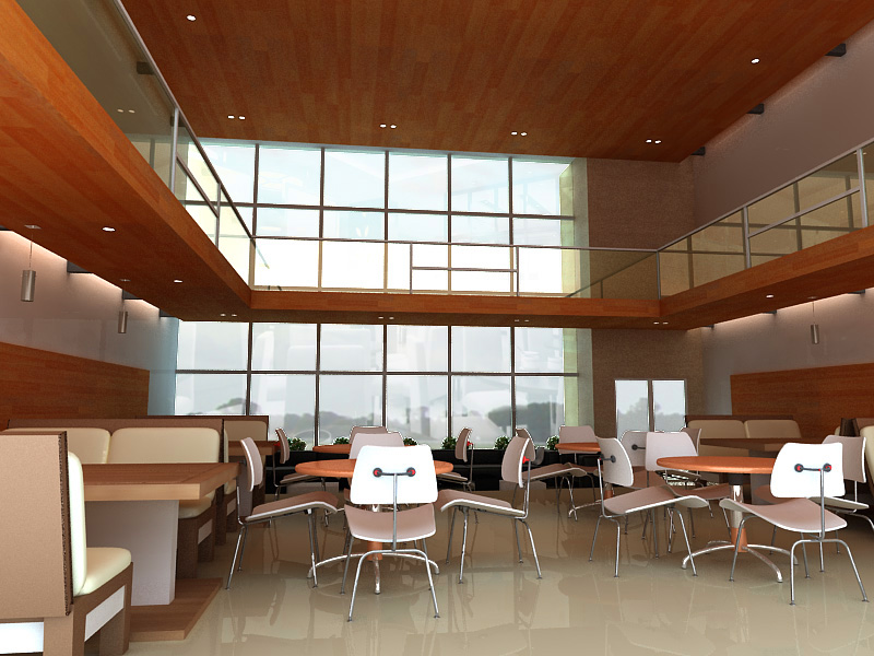
First post but not my first time.
+6
bokkins
vamp_lestat
aldrinv2
jenaro
Mastersketzzz
Critique1407
10 posters
:: 3d Gallery :: Exteriors
Page 1 of 1
 First post but not my first time.
comments and critics naman diyan sir. Tsaka kahit negative. welcome d2 sa post ko. hehe
[img] [/img]
[img]
 [/img]
Last edited by Critique1407 on Mon Mar 02, 2009 5:09 am; edited 1 time in total (Reason for editing : blurred pic)

Critique1407- CGP Apprentice

- Number of posts : 288
Age : 38
Location : Pampanga
Registration date : 09/11/2008
 Re: First post but not my first time.
welcome to CGP sir, A higher resolution might be better, rendering is good, better BG maybe and shadow will complete your composition, the rest..okay... post more and God Bless...
Mastersketzzz- CGP Apprentice

- Number of posts : 636
Age : 46
Location : Dubai
Registration date : 18/11/2008
 Re: First post but not my first time.
 ok ito sir!comment ko lang ung map ng wood...ung sa ceiling at sa lower ceiling same lang sila ng laki?i dont know kung dahil sa cam o sa map...but un lang comment ko...overall ok na poh sya sir!welcome sa cgp!keep posting...
jenaro- Peter Pran

- Number of posts : 3132
Age : 43
Location : sharjah
Registration date : 22/01/2009
 Re: First post but not my first time.
nakafield of view kasi ung view sir. kaya parang same lng ung map.

Critique1407- CGP Apprentice

- Number of posts : 288
Age : 38
Location : Pampanga
Registration date : 09/11/2008
 Re: First post but not my first time.
Sir,
Imho na lang on space planning. Seat back nakadikit na sa table on the left. You can move itong chair (sets of 4+table) into the center. Not necessary sa angle mo makita lang ng subject mo. 2nd mapping on the ceiling you've used is for flooring. Better to use wood planks. Para kasing nagkapalit ang flooring and ceiling map mo. yong lang sir. Keep on posting.
Imho na lang on space planning. Seat back nakadikit na sa table on the left. You can move itong chair (sets of 4+table) into the center. Not necessary sa angle mo makita lang ng subject mo. 2nd mapping on the ceiling you've used is for flooring. Better to use wood planks. Para kasing nagkapalit ang flooring and ceiling map mo. yong lang sir. Keep on posting.
 Re: First post but not my first time.
i agree with sir aldrin.. on space planning. anyways as for me.. your camera shot is a bit low... cant see whats happening on the rear part. all i see are the back of your chairs... other comments have been said.

vamp_lestat- CGP Guru

- Number of posts : 1930
Age : 41
Location : Davao City, Philippines
Registration date : 27/11/2008
 Re: First post but not my first time.
wood is too much sa ceiling. wood on the ceiling is low res, try to use a better one. meron sa www.arroway.de ng mas mgagandang maps. also, ung side ng second floor could be "not wood" para may break naman. tama si aldrinv2, try to change the congfig of the chairs and tables in the middle, diagonal is a good configuration. Good luck! 

 Re: First post but not my first time.
bokkins wrote:wood is too much sa ceiling. wood on the ceiling is low res, try to use a better one. meron sa www.arroway.de ng mas mgagandang maps. also, ung side ng second floor could be "not wood" para may break naman. tama si aldrinv2, try to change the congfig of the chairs and tables in the middle, diagonal is a good configuration. Good luck!
i agree... noticed some noise on the right side of your render... better high res bg... study anthropometrics...
 Comments accepted
Thank you sa comments sir. very appreciated po talaga. More critics pa sir. then pahelp din po s mga dapat gawin. Tips and tricks for good interior scene. I really need the guides of the CGPMasters. hehehe i'll post for other 3D's na inapply ung mga comment snyo sir. kahit violent payan. ok lng. hahaha

"Learn from our mistakes"

"Learn from our mistakes"

Critique1407- CGP Apprentice

- Number of posts : 288
Age : 38
Location : Pampanga
Registration date : 09/11/2008
 Re: First post but not my first time.
IMHO:
1. Furniture layout issues.
2. Wood is too much.
3. floor tiles might help.
4. look for better background.
5. noise issues.
yun lamang po sir...keep it up!

1. Furniture layout issues.
2. Wood is too much.
3. floor tiles might help.
4. look for better background.
5. noise issues.
yun lamang po sir...keep it up!

 Re: First post but not my first time.
natawa ako sa title ng post nyo sir ah!!!!! may konting kilite!!! hehehe!!!
nice post sir!! aprub ang lighting nyo!!!!
nice post sir!! aprub ang lighting nyo!!!!


pixelburn- CGP Guru

- Number of posts : 1436
Age : 40
Location : Dubai, SAN PEDRO, LAGUNA, Brunei Darrusalam
Registration date : 09/04/2009
 Similar topics
» Long time no post mga sir!!
» First-time na nag post
» First time to post here
» long time, no post
» 2nd post, 1st time in Vray
» First-time na nag post
» First time to post here
» long time, no post
» 2nd post, 1st time in Vray
:: 3d Gallery :: Exteriors
Page 1 of 1
Permissions in this forum:
You cannot reply to topics in this forum


