3-Storey Multi-Purpose Bldg.
+2
allnem
brodger
6 posters
Page 1 of 1
 3-Storey Multi-Purpose Bldg.
Papost po mga ka-CGP's...
balik aral po ulit. pa c&c naman po. TIA!
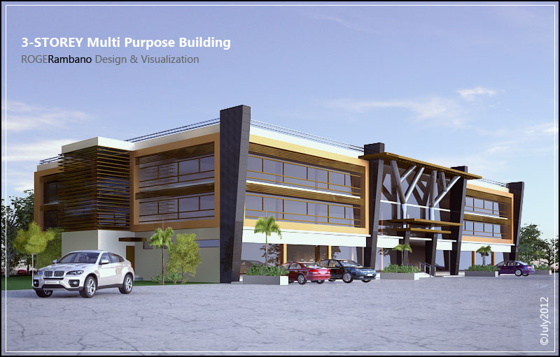
View 01
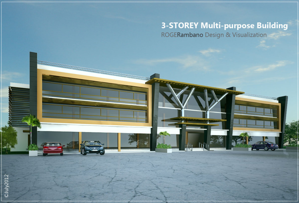
View 02
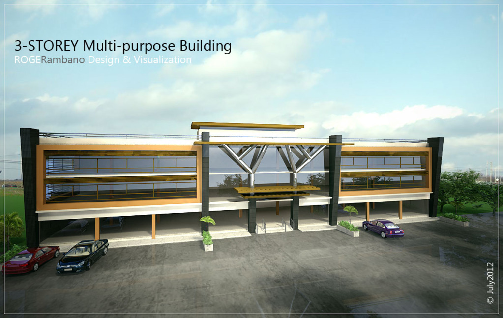
View 03
more power to CGP! God bless!
balik aral po ulit. pa c&c naman po. TIA!
View 01

View 02

View 03

more power to CGP! God bless!
Last edited by brodger on Mon Jul 30, 2012 11:23 pm; edited 1 time in total

brodger- CGP Guru

- Number of posts : 1747
Age : 46
Location : ligid ha Daguitan X Burawon
Registration date : 14/05/2010
 Re: 3-Storey Multi-Purpose Bldg.
Up lang po..
pa-comment naman po diyan..lalo na sa mga master's.
pa-comment naman po diyan..lalo na sa mga master's.

brodger- CGP Guru

- Number of posts : 1747
Age : 46
Location : ligid ha Daguitan X Burawon
Registration date : 14/05/2010
 Re: 3-Storey Multi-Purpose Bldg.
ganda sir...  veg lang po parang hindi realistic ang render po...pero ang design galing
 veg lang po parang hindi realistic ang render po...pero ang design galing
 Re: 3-Storey Multi-Purpose Bldg.
Some pointers, I hope this could help:
Design
1. Facade is heavy, those 'tree' elements are inappropriate considering it stands on a base columns.
2. Window frames are not define, each distance should be closer.
3. Since it's a commercial building, GF should be higher and signage space should be classified and shown.
4. Show proper sidewalks, parking space and roads.
Rendering
1. Add entourage, greens and reflection maps in front of the building so that reflection on windows are sensible. Add people if possible.
2. Try to position the cars should in a correct manner; on parking and on the road. Some are floating I suppose because of the shadows.
3. Change the road texture.
4. Avoid tiled mapping, look for seamless: eg. the huge columns on corners.
Good Luck and show us some changes (if you can).
 Re: 3-Storey Multi-Purpose Bldg.
allnem wrote:ganda sir...veg lang po parang hindi realistic ang render po...pero ang design galing
maraming salamat sa pagdaan master Allnem...oo nga po eh..try ko baguhin..sa uulitin po!


brodger- CGP Guru

- Number of posts : 1747
Age : 46
Location : ligid ha Daguitan X Burawon
Registration date : 14/05/2010
 Re: 3-Storey Multi-Purpose Bldg.
kurdaps! wrote:Some pointers, I hope this could help:
Design
1. Facade is heavy, those 'tree' elements are inappropriate considering it stands on a base columns.
2. Window frames are not define, each distance should be closer.
3. Since it's a commercial building, GF should be higher and signage space should be classified and shown.
4. Show proper sidewalks, parking space and roads.
Rendering
1. Add entourage, greens and reflection maps in front of the building so that reflection on windows are sensible. Add people if possible.
2. Try to position the cars should in a correct manner; on parking and on the road. Some are floating I suppose because of the shadows.
3. Change the road texture.
4. Avoid tiled mapping, look for seamless: eg. the huge columns on corners.
Good Luck and show us some changes (if you can).
Maraming salamat po master Kurdaps sa mga comments..
noted po lahat! laking tulong po nito! hanggang sa muli.


brodger- CGP Guru

- Number of posts : 1747
Age : 46
Location : ligid ha Daguitan X Burawon
Registration date : 14/05/2010

aesonck- CGP Expert

- Number of posts : 2448
Age : 44
Location : Philippines. La Trinidad-Visayas
Registration date : 13/07/2010
 Re: 3-Storey Multi-Purpose Bldg.
aesonck wrote:rocks!
Master aesonck salamat sa pagdaan! you also rocks! CGP rocks!


brodger- CGP Guru

- Number of posts : 1747
Age : 46
Location : ligid ha Daguitan X Burawon
Registration date : 14/05/2010
 Re: 3-Storey Multi-Purpose Bldg.
sir, ang ganda ng design nyo
jamesled- CGP Newbie

- Number of posts : 10
Age : 42
Location : Tagum City, Davao Del Norte
Registration date : 04/03/2012
 Re: 3-Storey Multi-Purpose Bldg.
jamesled wrote:sir, ang ganda ng design nyo
Thank you po sir jamesled..nagustuhan niyo po.

brodger- CGP Guru

- Number of posts : 1747
Age : 46
Location : ligid ha Daguitan X Burawon
Registration date : 14/05/2010
 Re: 3-Storey Multi-Purpose Bldg.
 sir,take the advice of the masters for additional info.
 keep posting sir
armoretro- CGP Apprentice

- Number of posts : 278
Age : 44
Location : madrid,spain
Registration date : 24/05/2012
 Re: 3-Storey Multi-Purpose Bldg.
armoretro wrote:nice concept
sir,take the advice of the masters for additional info.
keep posting sir
thanks po sir Armoretro..nagustuhan niyo po!

Opo..tama po..para po sa ikatututo natin yan..

brodger- CGP Guru

- Number of posts : 1747
Age : 46
Location : ligid ha Daguitan X Burawon
Registration date : 14/05/2010
Page 1 of 1
Permissions in this forum:
You cannot reply to topics in this forum


