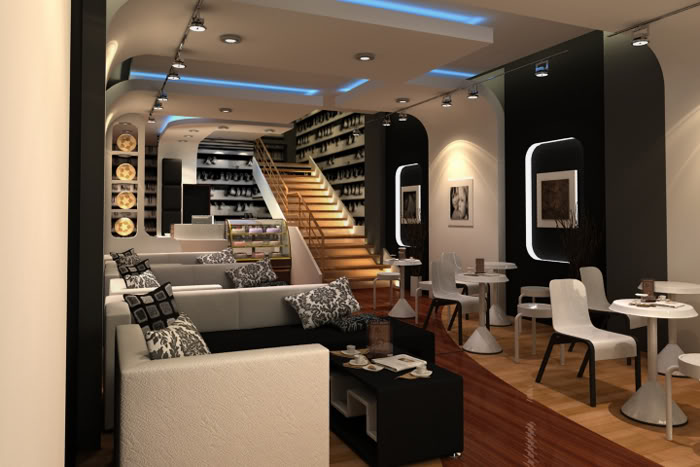
G12 coffee shop
+15
basky07
chillrender
meiahmaya
pakunat
jarul
christine
Yhna
nomeradona
Nico.Patdu
kurdaps!
Butz_Arki
aldrinv2
dickie_ilagan
bokkins
aa_meneses
19 posters
:: 3d Gallery :: Exteriors
Page 2 of 2
Page 2 of 2 •  1, 2
1, 2
 G12 coffee shop
First topic message reminder :
musta mga pips..post ko po tong interior project. simpleng coffee shop lng po. unang beses ko po mag render ng interior using vray at ao..C&C's po mga master lam ko daming kulang dito sa trabaho ko...maraming salamat po.
concept ko po dito is coffee shop at the same time photo gallery, i used black and white color to make it simplier and minimalist ung approach ng design. medyo conservative kasi yung budget kaya la masyadong abobot at para tipid rin sa paint. i used wall paper na black and white coffee mugs na naka sabit. sa lighting lang ako bumawi to have an elegant look. hehehe medyo naghihigpit ng sinturon yung may ari nito. anyway this is a christian coffee shop no smoking and drinking of alcoholic breverage here..


Last edited by aa_meneses on Sun Jan 25, 2009 10:35 pm; edited 3 times in total

aa_meneses- CGP Apprentice

- Number of posts : 360
Age : 41
Location : davao city
Registration date : 28/09/2008
 Re: G12 coffee shop
mahusay!keep it up! 


basky07- CGP Newbie

- Number of posts : 134
Age : 43
Location : baryo matakla
Registration date : 16/01/2009
 Re: G12 coffee shop
hi sir archi? musta po?.,.,galing po ng post nyo nice presentation sir.,.,halos nasabi na pde ikoment sir.,., ung 1st image ung pillow mo parang nakalutang i min hnd nka attach sa sofa or namalikmata lang ako?.,. en sugest lang sir para sakin po too much glosy ung wood flooring mo en kulang pa sa sharpen akin lang po naman un sir.,., pero overall nice en very good for me.,.,gudluck sir en ingat po.,.,keep it up sir.,.,

carla3d- CGP Apprentice

- Number of posts : 709
Age : 40
Location : canada/phils.
Registration date : 30/09/2008
 Re: G12 coffee shop
christine wrote:nicely done for me sir archi. ganda ng design.. vintageykeep it up sir
slamat po maam nagustuhan nyo. galing din nung ginawa nyo.


aa_meneses- CGP Apprentice

- Number of posts : 360
Age : 41
Location : davao city
Registration date : 28/09/2008
 Re: G12 coffee shop
jarul wrote:wow,bosing,,eto pla ung ao na binabanat mo..hehe
cam corection lng 1st img..pillows in the sofa,pls rotate others,,parepareho kac eh arangement ser..glossy po yata ung sofa and wyt pilow sa 1st img..
stainless handrail is much better..the wyt tables,,a bit off for me lng naman..
para kac syang plate na binaligtad lang,,imho lng po bossing,,pro kung yan ang gusto nyo po,,no probs po..daming projcts ah,,,
pano ba mag cam correction master? dko alam eh..yup your rigth dun s mga pillows, parang naging pattern na, next time aplly ko yang comment mo. oo nga po master mattas pala yung reflection ng mat na nalagay ko sa sofa, bout sa handrail sir expensive po ang stainless, malulugi na ako sa construction hehehe. pd nman po kahit d stainless yung handrail i'll find a better color that would suit for the stairs. bout sa white tables, i choose it cos black and white yung concept eh,it odd nman if ill put diffrent color d na sya tutogma sa concept. ganito kasi yan master, when we design we should know whats the purpose of those things that we put in our design we should also include these factors functions & economics. maybe ill change the form/shape of the table.hehehe anyways salamat po sa matyaga mong pagpupuna sa trabaho ko. i appreciate it master..till sa next post ko..


aa_meneses- CGP Apprentice

- Number of posts : 360
Age : 41
Location : davao city
Registration date : 28/09/2008
 Re: G12 coffee shop
pakunat wrote:nice one bro. keep it up. nice concept
thanks master...


aa_meneses- CGP Apprentice

- Number of posts : 360
Age : 41
Location : davao city
Registration date : 28/09/2008
 Re: G12 coffee shop
kietsmark wrote:good rendering sir kunting adjust lang ng brightness... cnc ko is about sa design masyadong busy syang tingnan. kung coffee shop kasi it should be relaxing and cozy. Imho ung mga nakasabit na tasa ang nagpa-busy and parang ang sikip sa area na un pero kung titingnan mo e sapat naman ung space. optical illusion kumbaga. hope clear ibig ko sabihin hehehe
sir, bout sa coffee shop theres no legalism naman that it would be cozy and relaxing. the concept of this coffee shop is it can be a photogallery at the same time. i would like to break the trend kasi sir coz if mapapansin mo halos lahat ng coffee shop ay pare pareho yung dating, yung ambience ng place. i would like to be different, in this kind of manner i can attract people who will pass by this coffee shop kasi they will thought na gallery yung place. sinadya kung busy sir para may movement, kumbaga may activity sa area di sya stagnant, kasi nman sa mga gallery you have to transfer from one place to another. but i really appreciate your comment sir at least napuna mo at ngpapatunay na pinag masdan mo ng maigi yung work ko.maraming salamat po sir mark..til my next post..


aa_meneses- CGP Apprentice

- Number of posts : 360
Age : 41
Location : davao city
Registration date : 28/09/2008
 Re: G12 coffee shop
meiahmaya wrote:very nice rednering design post more
salamat po sir...


aa_meneses- CGP Apprentice

- Number of posts : 360
Age : 41
Location : davao city
Registration date : 28/09/2008
 Re: G12 coffee shop
chillrender wrote:Wow galing na ni Boss Bogart hehehe Keep posting Bro.....
salamat master chill..hehehe salamat sa mga tips..


aa_meneses- CGP Apprentice

- Number of posts : 360
Age : 41
Location : davao city
Registration date : 28/09/2008
 Re: G12 coffee shop
basky07 wrote:mahusay!keep it up!
thanks sir...


aa_meneses- CGP Apprentice

- Number of posts : 360
Age : 41
Location : davao city
Registration date : 28/09/2008
 Re: G12 coffee shop
carla3d wrote:hi sir archi? musta po?.,.,galing po ng post nyo nice presentation sir.,.,halos nasabi na pde ikoment sir.,., ung 1st image ung pillow mo parang nakalutang i min hnd nka attach sa sofa or namalikmata lang ako?.,. en sugest lang sir para sakin po too much glosy ung wood flooring mo en kulang pa sa sharpen akin lang po naman un sir.,., pero overall nice en very good for me.,.,gudluck sir en ingat po.,.,keep it up sir.,.,
hello maam, im fine medyo busy.hehe salamat po maam at nagustuha nyo. tama po kayo dko na adjust yung pillow. hehe bout sa flooring po sagad na po yan kaso glossy pa rin.dko nga alam san pa iadjust para mwala yung glossy effect niya. maraming salamat po sa pagdalaw maam. likewise po..

aa_meneses- CGP Apprentice

- Number of posts : 360
Age : 41
Location : davao city
Registration date : 28/09/2008
 Re: G12 coffee shop
aa_meneses wrote:kietsmark wrote:good rendering sir kunting adjust lang ng brightness... cnc ko is about sa design masyadong busy syang tingnan. kung coffee shop kasi it should be relaxing and cozy. Imho ung mga nakasabit na tasa ang nagpa-busy and parang ang sikip sa area na un pero kung titingnan mo e sapat naman ung space. optical illusion kumbaga. hope clear ibig ko sabihin hehehe
sir, bout sa coffee shop theres no legalism naman that it would be cozy and relaxing. the concept of this coffee shop is it can be a photogallery at the same time. i would like to break the trend kasi sir coz if mapapansin mo halos lahat ng coffee shop ay pare pareho yung dating, yung ambience ng place. i would like to be different, in this kind of manner i can attract people who will pass by this coffee shop kasi they will thought na gallery yung place. sinadya kung busy sir para may movement, kumbaga may activity sa area di sya stagnant, kasi nman sa mga gallery you have to transfer from one place to another. but i really appreciate your comment sir at least napuna mo at ngpapatunay na pinag masdan mo ng maigi yung work ko.maraming salamat po sir mark..til my next post..
if thats the case, you've got it aced bro!
 post more pa bro
Guest- Guest
 Re: G12 coffee shop
im fine medyo busy.hehe salamat po maam at nagustuha nyo. tama po kayo dko na adjust yung pillow. hehe bout sa flooring po sagad na po yan kaso glossy pa rin.dko nga alam san pa iadjust para mwala yung glossy effect niya. maraming salamat po sa pagdalaw maam. likewise po..  [/quote]

sir try mo settings na to.,.baka makatulong.,.,kung ok sa yo.,.,ajas mo nalang ung reflect kung dka satisfied, en ung bump kung sobra bawasan mo nalang sir,.,.gudluck sir.,.

sir try mo settings na to.,.baka makatulong.,.,kung ok sa yo.,.,ajas mo nalang ung reflect kung dka satisfied, en ung bump kung sobra bawasan mo nalang sir,.,.gudluck sir.,.

carla3d- CGP Apprentice

- Number of posts : 709
Age : 40
Location : canada/phils.
Registration date : 30/09/2008
 Re: G12 coffee shop
wowowow chie... mau na diay ni... hehehe... ang galing neto bro... ibang klase nga itong coffee shop mo bro.. i like the breaking of whats the norm... galing ng sagot ah.. pang thesis.. hehehe... eto nlng bro... if wont mind.. parang masikip nga lang kasi xa tingnan.. siguro dahil dun sa space na kinain ng mga accent walls mo... un lang maybe try to check it out... pero great render ha... hehehe.. ibang iba dun sa preview na nakita ko..  hawd bai... and last nlng... bout sa reflection ng iyong wood flooring.. try this.. put the reflection RGB sa 30 and the refl. gloss sa .85 untick the fresnel... another approach.

vamp_lestat- CGP Guru

- Number of posts : 1930
Age : 41
Location : Davao City, Philippines
Registration date : 27/11/2008
 Re: G12 coffee shop
aa_meneses wrote:
bout sa white tables, i choose it cos black and white yung concept eh,it odd nman if ill put diffrent color d na sya tutogma sa concept. ganito kasi yan master, when we design we should know whats the purpose of those things that we put in our design we should also include these factors functions & economics. :
yepz,,ur defintly corect master...lam ko po un,,,,i was just botherd by the table design and not in the colors of it and nothing else....its just a nitpik master..heheh....kip posting ser...galing...
 Re: G12 coffee shop
aa_meneses wrote:musta mga pips..post ko po tong interior project. simpleng coffee shop lng po. unang beses ko po mag render ng interior using vray at ao..C&C's po mga master lam ko daming kulang dito sa trabaho ko...maraming salamat po.
concept ko po dito is coffee shop at the same time photo gallery, i used black and white color to make it simplier and minimalist ung approach ng design. medyo conservative kasi yung budget kaya la masyadong abobot at para tipid rin sa paint. i used wall paper na black and white coffee mugs na naka sabit. sa lighting lang ako bumawi to have an elegant look. hehehe medyo naghihigpit ng sinturon yung may ari nito. anyway this is a christian coffee shop no smoking and drinking of alcoholic breverage here..
coffees should be enjoyed w frens,i tot e overall design and perspective is good but the ambience and home feeling is not there-suggestions : use fabrics to soften e design,use more comfy furnitures .

glensky- CGP Apprentice

- Number of posts : 440
Location : stranded in singapore for 17 yrs
Registration date : 06/10/2008
 Re: G12 coffee shop
ARCHITHEKTHURA wrote:Nice renders sir..Like the second image..Nice designs too.Keep it up.
thank you sir..


aa_meneses- CGP Apprentice

- Number of posts : 360
Age : 41
Location : davao city
Registration date : 28/09/2008
 Re: G12 coffee shop
carla3d wrote:im fine medyo busy.hehe salamat po maam at nagustuha nyo. tama po kayo dko na adjust yung pillow. hehe bout sa flooring po sagad na po yan kaso glossy pa rin.dko nga alam san pa iadjust para mwala yung glossy effect niya. maraming salamat po sa pagdalaw maam. likewise po..

sir try mo settings na to.,.baka makatulong.,.,kung ok sa yo.,.,ajas mo nalang ung reflect kung dka satisfied, en ung bump kung sobra bawasan mo nalang sir,.,.gudluck sir.,.[/quote]
maraming salamat po maam carla. malaking tulong po ito para skin. how nice of you. thank you ulet

aa_meneses- CGP Apprentice

- Number of posts : 360
Age : 41
Location : davao city
Registration date : 28/09/2008
 Re: G12 coffee shop
[quote="glensky"]
sir thank you for your comment. i appreciated it.. i would like to explain my side sir of course there is nothing wrong with what you've said. for me, we dont have to be legalistic about the ambience of the coffee shop that it would be cozy, homie feeling, etc. it was so happened that it is the trend right now thats why most of the designers/architects follow it. we dont need to be a follower of the trend, we should create our own idea/s and we should not be limit by what is the trend. ika nga we can always break the rules in designing as long as you can justify it, like what hadid and gehry were doing..
aa_meneses wrote:musta mga pips..post ko po tong interior project. simpleng coffee shop lng po. unang beses ko po mag render ng interior using vray at ao..C&C's po mga master lam ko daming kulang dito sa trabaho ko...maraming salamat po.
concept ko po dito is coffee shop at the same time photo gallery, i used black and white color to make it simplier and minimalist ung approach ng design. medyo conservative kasi yung budget kaya la masyadong abobot at para tipid rin sa paint. i used wall paper na black and white coffee mugs na naka sabit. sa lighting lang ako bumawi to have an elegant look. hehehe medyo naghihigpit ng sinturon yung may ari nito. anyway this is a christian coffee shop no smoking and drinking of alcoholic breverage here..
coffees should be enjoyed w frens,i tot e overall design and perspective is good but the ambience and home feeling is not there-suggestions : use fabrics to soften e design,use more comfy furnitures .
sir thank you for your comment. i appreciated it.. i would like to explain my side sir of course there is nothing wrong with what you've said. for me, we dont have to be legalistic about the ambience of the coffee shop that it would be cozy, homie feeling, etc. it was so happened that it is the trend right now thats why most of the designers/architects follow it. we dont need to be a follower of the trend, we should create our own idea/s and we should not be limit by what is the trend. ika nga we can always break the rules in designing as long as you can justify it, like what hadid and gehry were doing..


aa_meneses- CGP Apprentice

- Number of posts : 360
Age : 41
Location : davao city
Registration date : 28/09/2008
 Re: G12 coffee shop
wow ganda naman ng concept mo d2 bro keep it up post pa

jay3design- CGP Artist

- Number of posts : 1732
Location : Singapore
Registration date : 18/09/2008
Page 2 of 2 •  1, 2
1, 2
:: 3d Gallery :: Exteriors
Page 2 of 2
Permissions in this forum:
You cannot reply to topics in this forum


