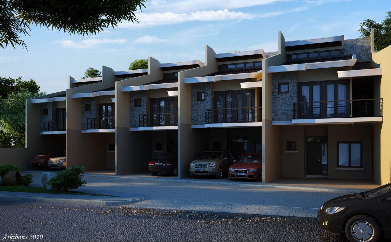
5-UNIT APARTMENT:First Commissioned Render-ADDITIONAL VIEW-
+30
IAN02
zdesign
gerico_eco
natzki
jc01
wyntallo
jzonjzonjzon
ar_monzter
ortzak
CNgarcia
chymera14
arjun_samar
rhizen
3dpjumong2007
manex
jhero
effreymm
ARIST
ckosio
jarul
arkitrix
maximus aurelius
bugoy-69
ERICK
cloud20
akoy
mez
brodger
yaug_03
arkibons
34 posters
:: 3d Gallery :: Exteriors
Page 3 of 3
Page 3 of 3 •  1, 2, 3
 5-UNIT APARTMENT:First Commissioned Render-ADDITIONAL VIEW-
First topic message reminder :
Hi!! Cgpips Good Day!! Just wanna share again my first commissioned rush render... not my design modeling and render only..
almost 6 hours modeling, 2hours composition and 15minutes render..comments and suggestion are most welcome.. TIA!!
image 01

image 02 with another mood
Added cam04 afternoon mood daw!

Cropped image:

Hi!! Cgpips Good Day!! Just wanna share again my first commissioned rush render... not my design modeling and render only..
almost 6 hours modeling, 2hours composition and 15minutes render..comments and suggestion are most welcome.. TIA!!
image 01

image 02 with another mood
Added cam04 afternoon mood daw!

Cropped image:

Last edited by arkibons on Mon Oct 18, 2010 10:59 pm; edited 2 times in total

arkibons- CGP Expert

- Number of posts : 2618
Age : 50
Location : manila, makati, samar
Registration date : 20/02/2009
 Re: 5-UNIT APARTMENT:First Commissioned Render-ADDITIONAL VIEW-
hehehe basic na sayo ang ganitong mood...mas maganda to tol kung lagyan mo ng down light yong may dark area para mas umangat sya.konting ilaw lang ba para makita lang yong loob like part ng garahe mo bounce mo lang sa wall...imho
 Re: 5-UNIT APARTMENT:First Commissioned Render-ADDITIONAL VIEW-
natzki wrote:nice one bro...medyo dark lang yung image... if you compare sa previous visuals mo i think this is slightly different.
Thanks Natzki!!! yap siguro sa post image processing di ko makuha iksaktong liwanag kc sa monitor ko maliwanag!! naman!!!
gerico_ecosystem wrote:ok yung design nyo sir, medyo madilim lng sir.


noted Gerico!!! thanks

arkibons- CGP Expert

- Number of posts : 2618
Age : 50
Location : manila, makati, samar
Registration date : 20/02/2009
 Re: 5-UNIT APARTMENT:First Commissioned Render-ADDITIONAL VIEW-
zdesign wrote:hehehe basic na sayo ang ganitong mood...mas maganda to tol kung lagyan mo ng down light yong may dark area para mas umangat sya.konting ilaw lang ba para makita lang yong loob like part ng garahe mo bounce mo lang sa wall...imho
thanks master Z!!! oo nga di ko pa rin maconfigure monitor ko hehehe!! kaya kulang sa post editing!! nice idea maybe a down light will help brightened dark areas!!!

arkibons- CGP Expert

- Number of posts : 2618
Age : 50
Location : manila, makati, samar
Registration date : 20/02/2009
 Re: 5-UNIT APARTMENT:First Commissioned Render-ADDITIONAL VIEW-
mat trade mark talaga gawa mo sir

IAN02- CGP Apprentice

- Number of posts : 490
Age : 37
Location : pampanga
Registration date : 10/06/2010
 Re: 5-UNIT APARTMENT:First Commissioned Render-ADDITIONAL VIEW-
IAN02 wrote:mat trade mark talaga gawa mo sir
thanks Ian02!!
thanthan wrote:galing nito sir

salamat pre!!!

arkibons- CGP Expert

- Number of posts : 2618
Age : 50
Location : manila, makati, samar
Registration date : 20/02/2009
 Re: 5-UNIT APARTMENT:First Commissioned Render-ADDITIONAL VIEW-
zdesign wrote:hehehe basic na sayo ang ganitong mood...mas maganda to tol kung lagyan mo ng down light yong may dark area para mas umangat sya.konting ilaw lang ba para makita lang yong loob like part ng garahe mo bounce mo lang sa wall...imho
I agree with this comment, madilim masyado yung rendering for my personal preference. Rememeber the client wants to show their project in the "best light" (no pun intended), so one of the things they will immediately notice is that madilim tignan yung building. You can always try using a linear work flow to make things brighter.
LWF- CGP Newbie

- Number of posts : 92
Age : 49
Location : 17th Ave.
Registration date : 12/12/2008
 Re: 5-UNIT APARTMENT:First Commissioned Render-ADDITIONAL VIEW-
LWF wrote:zdesign wrote:hehehe basic na sayo ang ganitong mood...mas maganda to tol kung lagyan mo ng down light yong may dark area para mas umangat sya.konting ilaw lang ba para makita lang yong loob like part ng garahe mo bounce mo lang sa wall...imho
I agree with this comment, madilim masyado yung rendering for my personal preference. Rememeber the client wants to show their project in the "best light" (no pun intended), so one of the things they will immediately notice is that madilim tignan yung building. You can always try using a linear work flow to make things brighter.
Thanks Sir noted po!!

arkibons- CGP Expert

- Number of posts : 2618
Age : 50
Location : manila, makati, samar
Registration date : 20/02/2009
 Re: 5-UNIT APARTMENT:First Commissioned Render-ADDITIONAL VIEW-
ang galing sir ayos 


archshade02- CGP Guru

- Number of posts : 1160
Age : 43
Location : kuwait
Registration date : 07/09/2010
 Re: 5-UNIT APARTMENT:First Commissioned Render-ADDITIONAL VIEW-
grabe ka na pare!!!!! ang layo mo na!!!!

alwin- CGP Expert

- Number of posts : 2176
Age : 51
Location : basurero sa cebu
Registration date : 22/01/2009
 Re: 5-UNIT APARTMENT:First Commissioned Render-ADDITIONAL VIEW-
archshade02 wrote:ang galing sir ayos
thanks a lot archshader!!
alwin wrote:grabe ka na pare!!!!! ang layo mo na!!!!
thanks alwin!! musta?

arkibons- CGP Expert

- Number of posts : 2618
Age : 50
Location : manila, makati, samar
Registration date : 20/02/2009
Page 3 of 3 •  1, 2, 3
 Similar topics
» Practice Render(additional view)
» commissioned interior render <more interiors!!!>
» 4-Unit Apartment
» 4 Unit Apartment
» 3 unit apartment
» commissioned interior render <more interiors!!!>
» 4-Unit Apartment
» 4 Unit Apartment
» 3 unit apartment
:: 3d Gallery :: Exteriors
Page 3 of 3
Permissions in this forum:
You cannot reply to topics in this forum


