series of re-rendered 3d and new one
+10
marcelinoiii
yaug_03
westcoastwindblow
grappy
LadiesMan217
arkiedmund
torring
balongeisler
jeb_uap
Norman
14 posters
:: 3d Gallery :: Exteriors
Page 1 of 1
 series of re-rendered 3d and new one
practice pa rin and pang dagdag ng interior portfolio....still want to thank sir celes for those inspiring words and comments...with sir erick on his kalandian PS technique..it works!!!!

inspired by sir mund...hehe..gagaya puto maya din ako e....ito yung link -
http://www.cgpinoy.org/architectural-f3/shades-of-gray-updated-t9595.htm
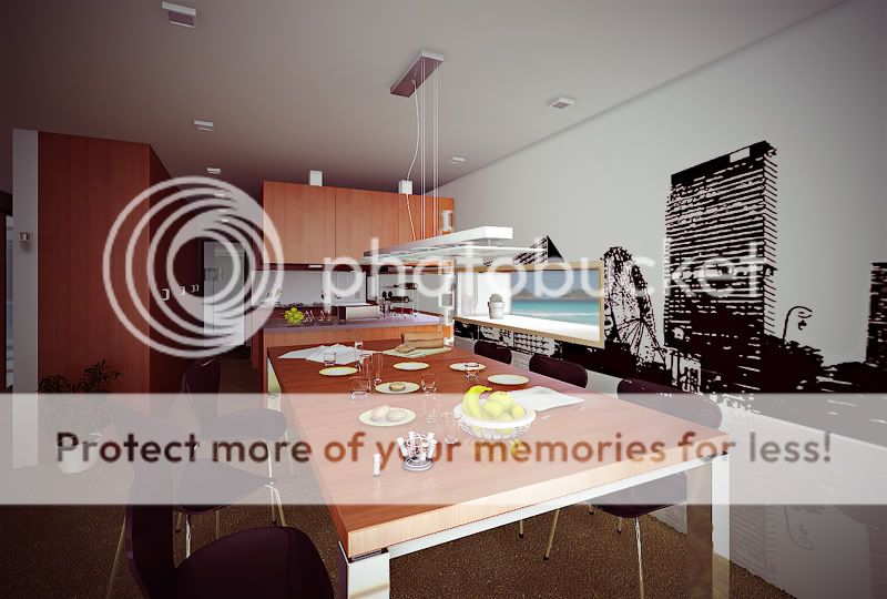
old work re-rendered with another view -
http://www.cgpinoy.org/architectural-f3/4th-share-ko-t5488.htm?highlight=share
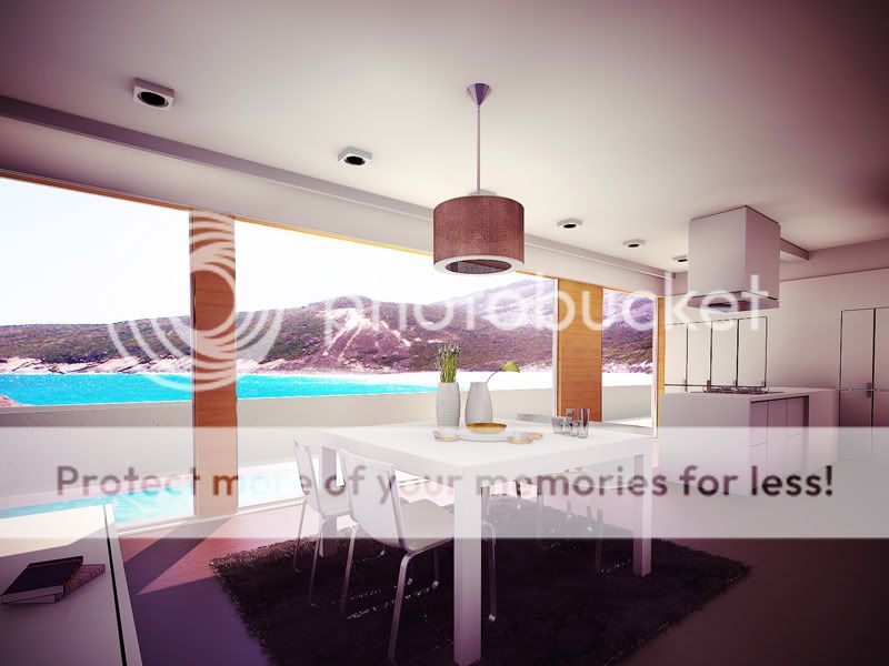
kita ko lang sa magazine...
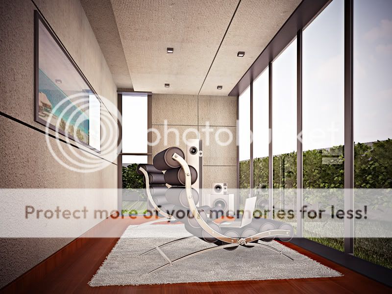
ito yung nakakahilong angle ng BG re-rendered -
http://www.cgpinoy.org/architectural-f3/17th-share-ko-t9978.htm?highlight=share
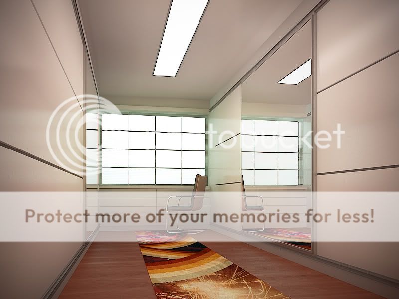
isa pang practice

another view
all re-rendered with AO pass tapos add ng color correction at lens correction with vignette effect sa PS....

inspired by sir mund...hehe..gagaya puto maya din ako e....ito yung link -
http://www.cgpinoy.org/architectural-f3/shades-of-gray-updated-t9595.htm

old work re-rendered with another view -
http://www.cgpinoy.org/architectural-f3/4th-share-ko-t5488.htm?highlight=share

kita ko lang sa magazine...

ito yung nakakahilong angle ng BG re-rendered -
http://www.cgpinoy.org/architectural-f3/17th-share-ko-t9978.htm?highlight=share

isa pang practice

another view
all re-rendered with AO pass tapos add ng color correction at lens correction with vignette effect sa PS....

Norman- CGP Expert

- Number of posts : 3228
Registration date : 21/06/2009
 Re: series of re-rendered 3d and new one
galing master.. great set of renderings..

jeb_uap- CGP Apprentice

- Number of posts : 233
Age : 44
Location : Washington Drive
Registration date : 30/11/2009
 Re: series of re-rendered 3d and new one
Ganda lahat mga ubra bro..... like 2nd image

torring- CGP Apprentice

- Number of posts : 658
Age : 55
Location : Tacloban City
Registration date : 04/01/2009
 Re: series of re-rendered 3d and new one
very nice...ganda lahat..magsuggest nalang ako:
1. sa unang image, yung background, parang kakaiba ang kulay ng sky.
2. The second image, check scale ng accessories, parang maliit yung lalagyan ng asin, or baka sa camera lamang.
3. The rest are good sets.
Galing niyo pala sir...paturo din ako..
1. sa unang image, yung background, parang kakaiba ang kulay ng sky.
2. The second image, check scale ng accessories, parang maliit yung lalagyan ng asin, or baka sa camera lamang.
3. The rest are good sets.
Galing niyo pala sir...paturo din ako..

arkiedmund- Manager

- Number of posts : 3956
Age : 51
Location : Cavite
Registration date : 19/09/2008
 Re: series of re-rendered 3d and new one
I like images 2,3 and 5! 


grappy- CGP Newbie

- Number of posts : 65
Age : 47
Location : Philippines
Registration date : 04/03/2010
 Re: series of re-rendered 3d and new one
galing ah subra , magaya din nga
westcoastwindblow- CGP Newbie

- Number of posts : 73
Age : 39
Location : hidden villige
Registration date : 11/08/2009
 Re: series of re-rendered 3d and new one
salamat sir sa pagbisita....jeb_uap wrote:galing master.. great set of renderings..
thanks sir bal sa pagdaan...balongeisler wrote:wow...ayos man.
thanks sir....kundi dahil sa sa CGP....di ako makakapag upgrade sa sarili kotorring wrote:Ganda lahat mga ubra bro..... like 2nd image
arkiedmund wrote:very nice...ganda lahat..magsuggest nalang ako:
1. sa unang image, yung background, parang kakaiba ang kulay ng sky.
2. The second image, check scale ng accessories, parang maliit yung lalagyan ng asin, or baka sa camera lamang.
3. The rest are good sets.
Galing niyo pala sir...paturo din ako..
di ba sir dapat kayo ang magtuturo?!!!..hehe kaya nga kayo ginaya ko e...inspiring gawa nyo!!!..
tayo tayo lang naman ang magtutulungan e..noted din po yung mga sinabi nyo sir mund....
thanks bro...lufet mo rin e...LadiesMan217 wrote:ayos
thanks sir grappy....kung may question po kayo PM nyo lang ako...grappy wrote:I like images 2,3 and 5!
hehe....uu bro gaya na!!!salamat sa pagdaanwestcoastwindblow wrote:galing ah subra , magaya din nga

Norman- CGP Expert

- Number of posts : 3228
Registration date : 21/06/2009
 Re: series of re-rendered 3d and new one
BG lang siguro para bumagay sa ambiance.Nice practice 


yaug_03- CGP Guru

- Number of posts : 1911
Age : 41
Location : Cainta,Rizal
Registration date : 05/07/2009
 Re: series of re-rendered 3d and new one
ok bro!!! may kakaibang mood ang mga renders mo, tatak F41 hehe... Congrats sa well presented Folio mo! Ayos!!! Good luck sa yo pre. 

marcelinoiii- CGP Guru

- Number of posts : 1125
Age : 42
Location : Singapore
Registration date : 29/07/2009
 Re: series of re-rendered 3d and new one
lighting & camera view rock n roll s akin.. ano yung kalandian n PS techniques? interesting yan ha.. keep rockin bro!
 Re: series of re-rendered 3d and new one
norman! pa comment lang.. hope will be able to help - constructive to ha 
1. image 1 - nice lighting, pero too much adobe red in the composition (was this done in post?) and the wood floor texture looks too evenly bumpy.
2. image 2 - your reddish PP here works fine (still need to lessen those red tones though) - but there are some black lines (unsharp mask? sharpened? subpixel mapping off?) that you need to minimize.
3. image 3 - mukhang nasa red mode ka ngayon in PP though this is good, ung outdoor image seems to ruin it - that blue water seems so unnatural and judging sa intensity ng room, my guess is your background should be overexposed too.
4. image 4 - frankly i prefered the first post you did - just enhance the background, right now kasi ung chair mo seems to float (no shadows)
5. image 5 and 6 - too sharpened or subpixel mapping was turned off. but it's good that you posted image 5 because this might be an exception to the vertical line rule.
notice how the illusion in the left wall "bends" your vertical line? such a case means that it is better to tilt the camera a bit to avoid this optical illusion.
un lang norman keep building your portfolio.
1. image 1 - nice lighting, pero too much adobe red in the composition (was this done in post?) and the wood floor texture looks too evenly bumpy.
2. image 2 - your reddish PP here works fine (still need to lessen those red tones though) - but there are some black lines (unsharp mask? sharpened? subpixel mapping off?) that you need to minimize.
3. image 3 - mukhang nasa red mode ka ngayon in PP
4. image 4 - frankly i prefered the first post you did - just enhance the background, right now kasi ung chair mo seems to float (no shadows)
5. image 5 and 6 - too sharpened or subpixel mapping was turned off. but it's good that you posted image 5 because this might be an exception to the vertical line rule.
notice how the illusion in the left wall "bends" your vertical line? such a case means that it is better to tilt the camera a bit to avoid this optical illusion.
un lang norman keep building your portfolio.

celes- Pogi

- Number of posts : 2958
Age : 52
Location : Singapore
Registration date : 25/11/2008
 Re: series of re-rendered 3d and new one
thanak bro sa pagdaan.....nted po yung comment nyo...yaug_03 wrote:BG lang siguro para bumagay sa ambiance.Nice practice
hehe..thanks bro.....kaw din e...Mr. MR....marcelinoiii wrote:ok bro!!! may kakaibang mood ang mga renders mo, tatak F41 hehe... Congrats sa well presented Folio mo! Ayos!!! Good luck sa yo pre.
master cgil...salamat sa pagdaan....yung kalandian term - photoshop lang po yun using color correction and lens correction with other stuff....yung technique ni sir erick doing some post process sa work. anyway, he made a big name under his own style of rendering and it is very effective. love his work......thank you ulit bossingcgil wrote:lighting & camera view rock n roll s akin.. ano yung kalandian n PS techniques? interesting yan ha.. keep rockin bro!
celes wrote:norman! pa comment lang.. hope will be able to help - constructive to ha
1. image 1 - nice lighting, pero too much adobe red in the composition (was this done in post?) and the wood floor texture looks too evenly bumpy.
2. image 2 - your reddish PP here works fine (still need to lessen those red tones though) - but there are some black lines (unsharp mask? sharpened? subpixel mapping off?) that you need to minimize.
3. image 3 - mukhang nasa red mode ka ngayon in PPthough this is good, ung outdoor image seems to ruin it - that blue water seems so unnatural and judging sa intensity ng room, my guess is your background should be overexposed too.
4. image 4 - frankly i prefered the first post you did - just enhance the background, right now kasi ung chair mo seems to float (no shadows)
5. image 5 and 6 - too sharpened or subpixel mapping was turned off. but it's good that you posted image 5 because this might be an exception to the vertical line rule.
notice how the illusion in the left wall "bends" your vertical line? such a case means that it is better to tilt the camera a bit to avoid this optical illusion.
un lang norman keep building your portfolio.
uy sir!!! buti nagcomment ulit kayo...hintay tlga ako sa inyo e...and i really appreciate it!!!
for:
1. image 1 - nice lighting, pero too much adobe red in the composition (was this done in post?) and the wood floor texture looks too evenly bumpy.
- yes post processed lahat yun colors nya kaya ganun and bump ill adjust,
2. image 2 - your reddish PP here works fine (still need to lessen those red tones though) - but there are some black lines (unsharp mask? sharpened? subpixel mapping off?) that you need to minimize.
- yup PP pa rin po yung reddish. but yung black lines? san sir?
3. image 3 - mukhang nasa red mode ka ngayon in PP though this is good, ung outdoor image seems to ruin it - that blue water seems so unnatural and judging sa intensity ng room, my guess is your background should be overexposed too.
- HAHA...oo nga sir medyo na inlove ako sa red!!!nyahehe....maganda sa paningin ko dito e....yup thanks sir il adjust ulit po..post ko yung original renders nya...
4. image 4 - frankly i prefered the first post you did - just enhance the background, right now kasi ung chair mo seems to float (no shadows)
- because of the carpet na nilagay ko kaya mukhang lumutang...naglagay na ako ng AO dyan e..subukan kong adjust yung reflection ng stainless sa upuan sa tingin kong malaking impact din sya kaya mukhang lumulutang
5. image 5 and 6 - too sharpened or subpixel mapping was turned off. but it's good that you posted image 5 because this might be an exception to the vertical line rule.
- san sir yung submpixel mapping? ngayon ko lang narinig yan a...hmmm...sige sir research ko...
- image 5, oo nga sir no..mukhang hindi vertical yung line nya....naka-camera correct na yan....tama nga kayo kailangan kong e-tilt pa...kasi nagkakaroon ng illusion...
hehe..its a good sample sa thread ni sir boks ito....about vertical lines.
thanks sir celes for your comments....daming salamat tlga at laking tulong nyo sa amin mga bata...kaya wag mo mag-retire sir ha!!!

Norman- CGP Expert

- Number of posts : 3228
Registration date : 21/06/2009
 Re: series of re-rendered 3d and new one
Nice set bro, gusto ko ung 3rd image. anyway nasabi na lahat ng master comments. Keep posting 


Ernest- CGP Apprentice

- Number of posts : 508
Age : 41
Location : Quezon City
Registration date : 20/02/2010
 Re: series of re-rendered 3d and new one
great rendering especially the lighting, hmm ano ba ssbhin ko hindi ako palagawa nang mga interiors eh pero eto na muna, sa tingin ko hindi obvious yung mga glass nang exterior walls 

Nico.Patdu- CGP Guru

- Number of posts : 1406
Age : 38
Location : pale blue dot
Registration date : 03/11/2008
:: 3d Gallery :: Exteriors
Page 1 of 1
Permissions in this forum:
You cannot reply to topics in this forum


